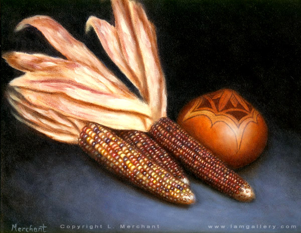
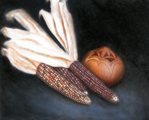
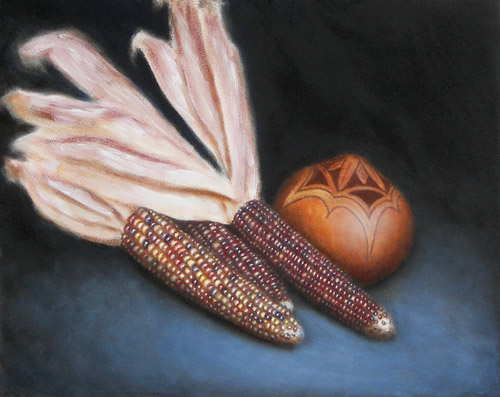
Indian Corn
Oils, 9x12, 2007
|
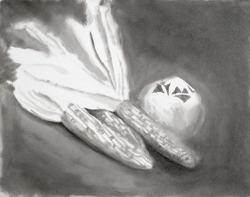
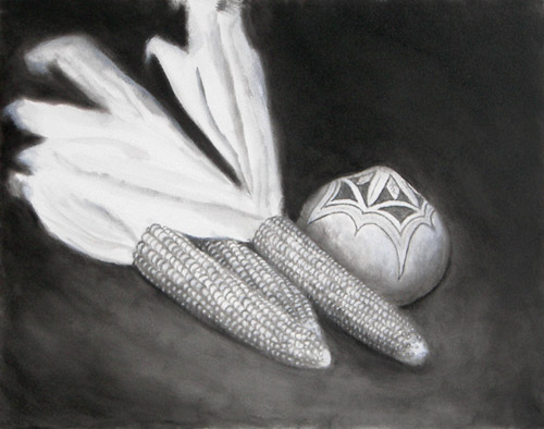
For this piece, I've decided to start with a grisaille. A grisaille (from the French 'grey') is a monochromatic underpainting to develop the values of a piece before adding color.
This is a rough grisaille, and will need to be refined after it is dry. I've done a basic sketch-in with black.
I'm using Gessobord as the base.
|
|
Here I've continued to refine the grisaille, adding details that will show in the final piece. The grisaille needs to be perfect rather than sketchy, as the application of color will only be with transparent glazes, and the values initialized in the grisaille will show through.
Here I've outlined where the kernels will be. I've still only used black so far.
|
|
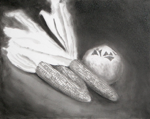
I'm applying white to all of the areas that will need pure color when I glaze. When doing a grisaille, it's important to get it cleaned up before adding any color, as any underlayers will show through the later glazes.
While time consuming, a grisaille is also nice because you can correct any value mistakes and get the picture laid out for the most part without worrying about color corrections as well.
I may spend one more day on the grisaille, and then I will start the glazes once the white is dry.
The rear and middle corn will actually be glazed quite dark, and I still have a ways to go on the grisaille for the other object, which will be a gourd pot. Since I haven't touched it too much yet, it doesn't have the 3D look which will explain what it is.
|
|
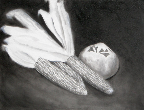
It should be noted that although grisailles look like black and white pictures, they should not be thought of as such when working with them. Rather, they should be thought of as midtone vs. shadow plots. Highlights will be added at the very end.
Also, the artist needs to keep in mind the darkness and the translucency of the final glaze color.
For example, I will be using burnt sienna and payne's grey in the final painting, both of which are relatively dark and very translucent colors. Therefore, if I want the pure color to show through rather than a murky, muddled color, I need to make sure that the areas underneath these colors is white, although a value map would not show the reference as being light-colored.
Shadows are easy to add later with extra glazing, but lighter colors are not, so it's better to keep something lighter than to make it too dark and regret it later.
|
|
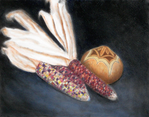
This is the first color glaze. There are still several layers of shadows and highlights to be added.
I'm basically just quickly scumbling the base colors onto the grisaille and I'll worry about refining it later.
|
|
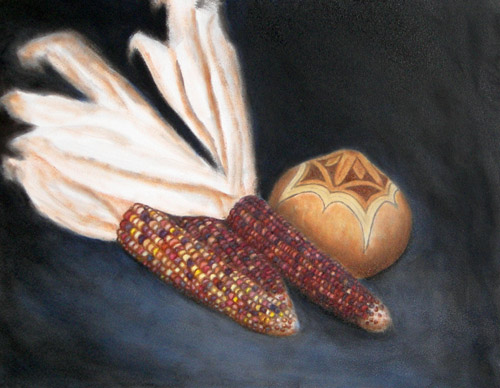
Here I've gone back and redefined the shadows on the kernels - I've used a mix of burnt sienna, payne's grey, and french ultramarine watered down as needed.
A pretty mindless process, but ended up taking about 3 hours!
BTW, this is oils on Ampersand Gessobord, 9x12.
|
|
Here's the fun part - highlights!
|
|
Here I've worked on the pot, and also added shadows in various places. Still have to work on the leaves.
|
|
This is where the steps get finicky. I added a brighter surface to help the corn stand out from the background more. I still need to mess more with the leaves.
|
|
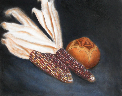
Here is the final painting. I've cleaned up the edges, finished the leaves, and added some extra glazing in certain areas.
|
|
|